To create an eye-catching, informative bi-fold brochure that effectively communicates the client’s offerings, enhances brand presence, and engages the target audience.
Tags
Project Brief
To create an eye-catching, informative bi-fold brochure that effectively communicates the client’s offerings, enhances brand presence, and engages the target audience.
The brochure needed to:
Clearly present the client’s unique selling points (USPs).
Include visually engaging imagery to capture attention.
Maintain brand consistency across colors, fonts, and logo placement.
Our Approach
01. Discovery and Research:
We began by understanding the client’s brand identity, target audience, and marketing goals. This helped us define the tone, style, and structure of the brochure. Competitor analysis and market research also guided the design direction.
02. Concept Development:
Based on our findings, we proposed two design concepts:
Option 1: A modern, minimalist design that focused on clean lines, bold typography, and a simple color palette.
Option 2: A more vibrant, dynamic design with large visuals, creative layouts, and engaging copy to emphasize the client’s key services.
03. Design Execution:
After the client selected their preferred concept, we moved forward with crafting the bi-fold brochure:
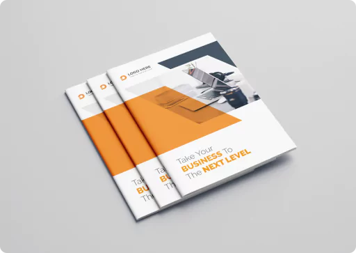
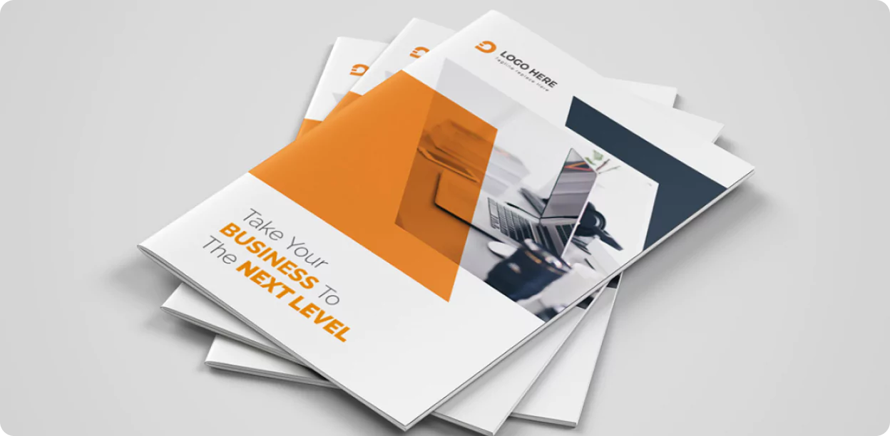
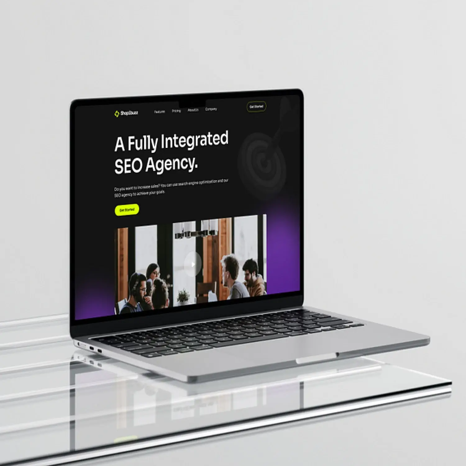
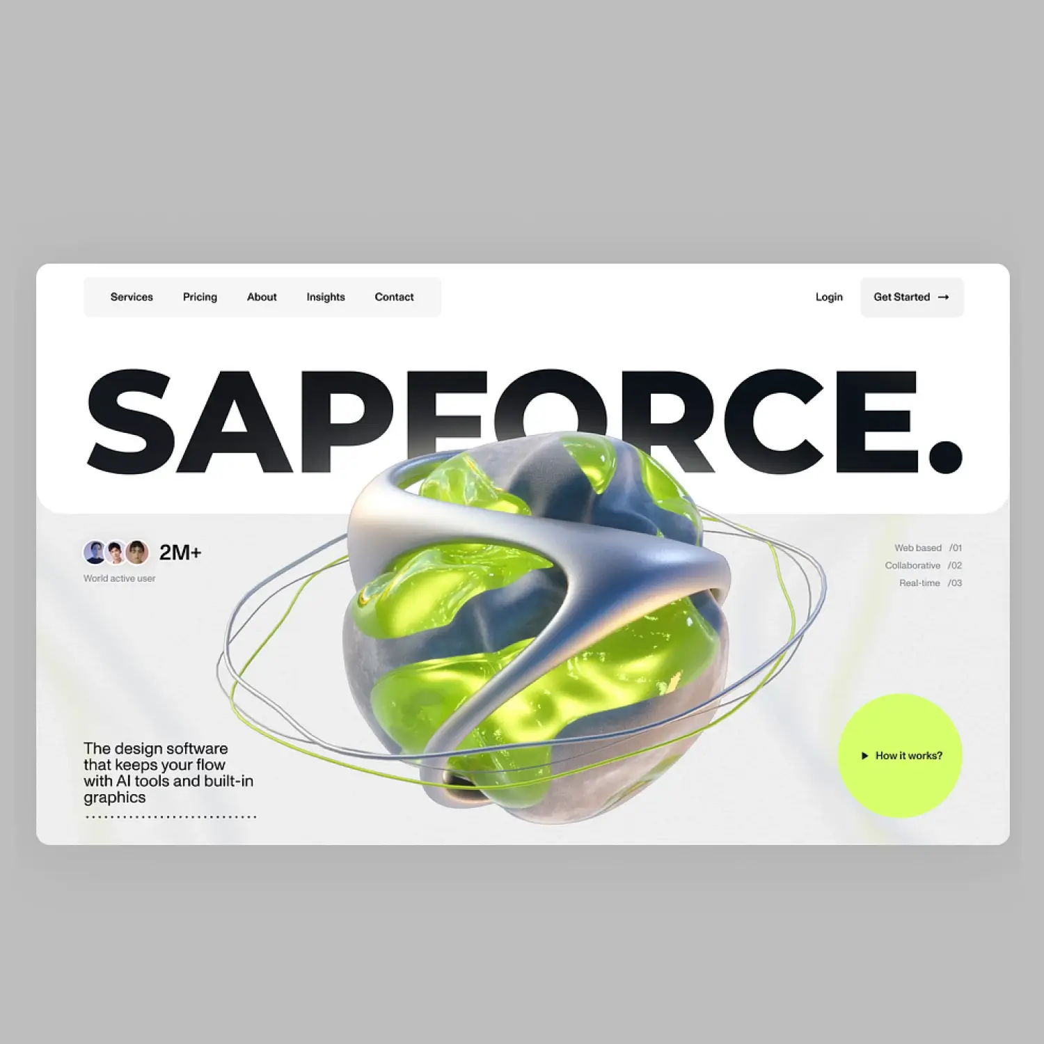
Front Cover: A striking cover featuring the client’s logo, tagline, and a powerful image that resonated with their brand story.
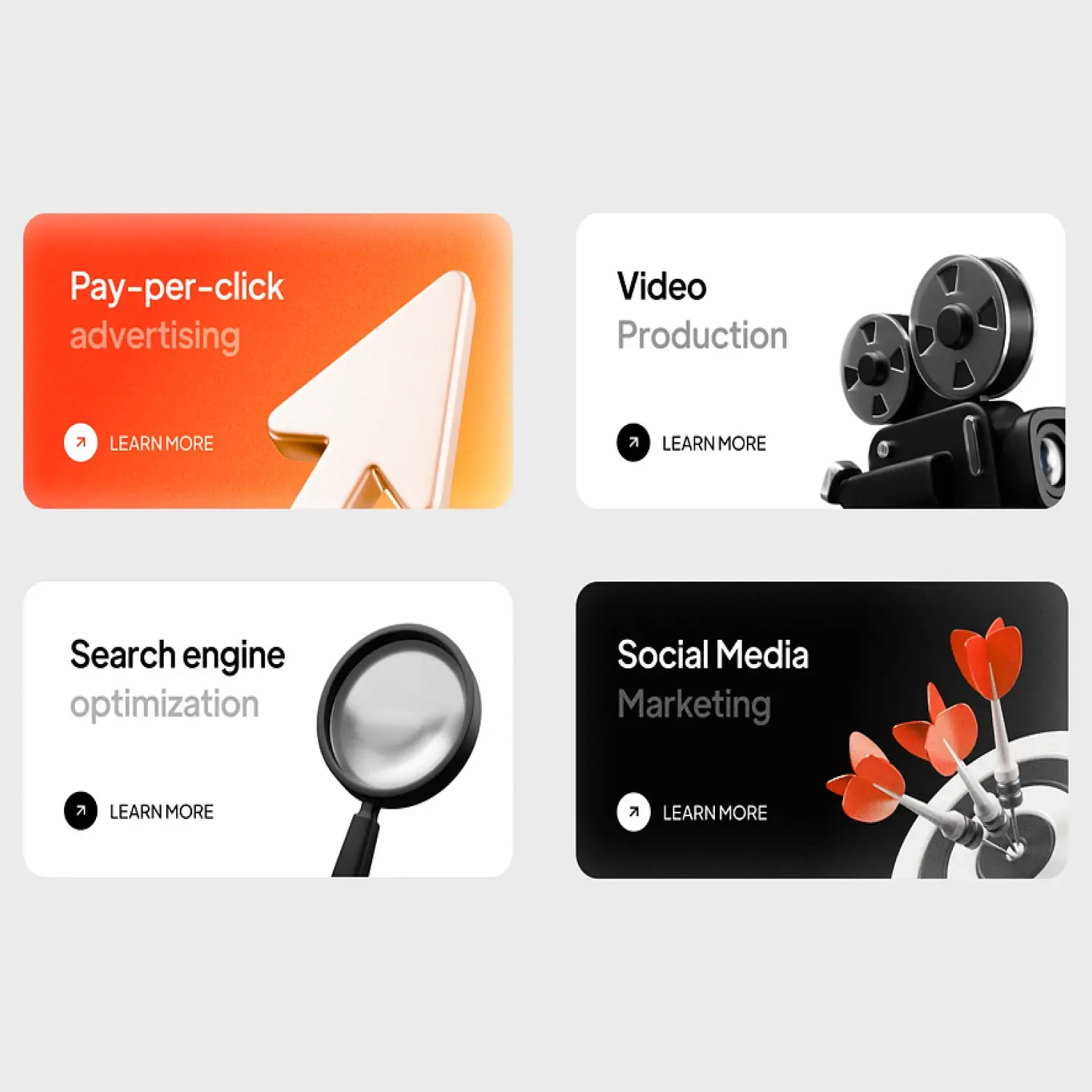
Inside Spread: Clear sectioning for the client’s services, with each segment visually distinguished using icons, headings, and imagery. We used a hierarchy of information to guide the reader’s eye.
Back Cover: A prominent CTA along with the client’s contact information and social media handles, encouraging potential customers to reach out. emphasize the client’s key services.
04. Brand Consistency:
We ensured the use of the client’s established brand colors and fonts throughout the design. Additionally, the logo placement and style aligned with the client’s existing marketing collateral to maintain consistency across channels.
05. Copywriting:
We provided concise, persuasive copy to convey the client’s key messages without overwhelming the reader. Each section was tailored to highlight the client’s value proposition, services, and competitive advantage.
Final Result
The final design was a visually appealing, easy-to-read bi-fold brochure that effectively showcased the client’s offerings. The client was thrilled with the outcome, noting the brochure’s clean design, brand consistency, and engaging format.
Key Design Features:
Minimalist Aesthetic: A sleek, modern design with plenty of white space to avoid clutter.
High-Quality Imagery: Carefully selected images that reflected the client’s brand values.
Clear CTA: Strategic placement of the CTA to encourage immediate action.
Engaging Layout: A well-balanced layout that guided the reader’s attention through the content effortlessly.
Results and Impact
Enhanced Brand Image: The client’s branding was strengthened with a polished and professional marketing tool.
Increased Engagement: The brochure received positive feedback from stakeholders, leading to an increase in inquiries and interest in the client’s services.
Successful Distribution: The brochure became a key element of the client’s marketing materials, used at events, meetings, and in digital formats.
Results and Impact
The client expressed their satisfaction with the brochure, noting that it had a positive impact on their marketing efforts and provided a professional, cohesive piece of collateral to distribute to their target audience.
Client Feedback
We ensured the use of the client’s established brand colors and fonts throughout the design. Additionally, the logo placement and style aligned with the client’s existing marketing collateral to maintain consistency across channels.
Working with Spardge Design Agency was a fantastic experience! Their creativity and attention to detail exceeded our expectations. The bi-fold brochure they designed perfectly captured our brand and has been a huge hit with our clients. We couldn’t be happier with the results!”
Jackson & Miller Consulting
Anderson & Co
Conclusion
This bi-fold brochure design case study highlights how strategic design can elevate a brand’s marketing efforts, creating lasting impressions and driving results. The collaboration between Spardge Design Agency and [Client’s Name] resulted in a high-quality, impactful brochure that continues to support the client’s business growth.